A little more (or less) than meets the eye
I was inspired to write this blog when I was asked to train a fellow team member on the basics of printing. I realized it’s like Pandora’s box. Once opened, it’s hard to stop. As we grew deeper into our conversation, the common (and dreaded) question came up, “Why does color look so different on screen than it does printed?”
And I had the answer. But I thought it was best to start with the function of the human eye and history about color before blasting them with what RGB and CMYK means.
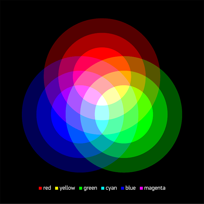
The human eye and brain collaborate to translate light into color. Isaac Newton found that color isn’t actually inherent in an object. The surface of the object reflects some colors and absorbs all the others. What we see is what’s reflected, and what is reflected is dependent on the properties of the object. This is based on the three basic primary colors of light – red, green and blue (RGB). Mixing the three creates all color that is seen by the human eye. Equal portions interchangeably create secondary colors – cyan, magenta, yellow, and so on.
Color in its physical form we’ve seen used historically from ceremonial cave walls, chapel ceilings and stunning works of art, to fabrics and furniture. Dyes and powders were derived from herbs, roots, animals, sea creatures and flowers. They were then mixed to produce variations of color. And whereas the colors that surround us daily are limitless to the human eye, they actually aren’t in the print world.
You’re thinking, surely if we can see it, we can produce an ink to match it, right? Not so much.

The digital world, be it TV, computer monitor or smart phone screen, works in RGB electronic light. We know that RGB when mixed proportionally (red + green, blue + red, etc.) creates secondary colors of cyan, magenta and yellow. If you were to mix red, green and blue inks, colors can become “muddied” and dark. No combination would create yellow or any other new “lighter” color, limiting the range of colors to print with. Therefore when printing, a set of primary ink colors is needed. Cyan, magenta and yellow (CMY), with the addition of black (K), allow more color possibilities, creating a larger gamut of ink color to at least try to print what our eye sees.
Deep breath. All of that said, inks act as little light filters. If paper is covered in ink, the ink reduces the light that would otherwise be reflected from the paper. And unfortunately, CMYK inks are not perfect at filtering light. Which finally answers that question… Color looks different on screen because there are RGB combinations that CMYK just simply cannot produce. Make’s total sense, right?
Could I have just provided that simple answer sooner? I could have, sure. But then you wouldn’t have all of this cool trivia to impress your friends.


